Most retention problems aren’t caused by bad products(!) Mobile churn, at its core, is caused by bad choices presented to users.
Every message you send (a push, an in-app message, a simple thank you email) is a micro-interaction that shapes user behavior. The way you frame those moments determines whether users stay, convert, or quietly drift away.
And the data backs it up. Apps that use a cross-channel approach to messaging see up to 93% higher engagement and a 55% boost in retention compared to single-channel strategies. Why? Because users don’t want to be herded through one path. They want the freedom to choose where and how they engage.
The decision you want your users to make (whether it’s to stay, explore, or buy) should feel like their own.

Behavioral economists call this concept Choice Architecture—the art of structuring decisions in a way that gently guides users toward the best outcome without taking away their freedom to choose.
Below, we’ll pull back the curtain on how to use choice design principles in your mobile messaging to create messages that feel natural, not forced.
Why Choice Design matters for retention (especially during the holidays)
The holidays are a marketer’s paradox… full of opportunity, but also overflowing with noise. Between flash sales, “last chance” reminders, and countdown emails, most of your users are honestly quite short on mental bandwidth, and that’s an easy thing to forget amidst the Q4 buzz.
To pick up where we left off, above: when users feel like they’re steering the experience, they’re far more likely to stick around long after the sale ends.
The simplest example? A push notification that says,
“Your 20% discount ends soon. Tap to buy before it’s gone!”
...gives users one choice: act now or miss out.
The alternative,
“Your 20% offer is here when you’re ready. Want a reminder tomorrow?”
...gives them ownership.
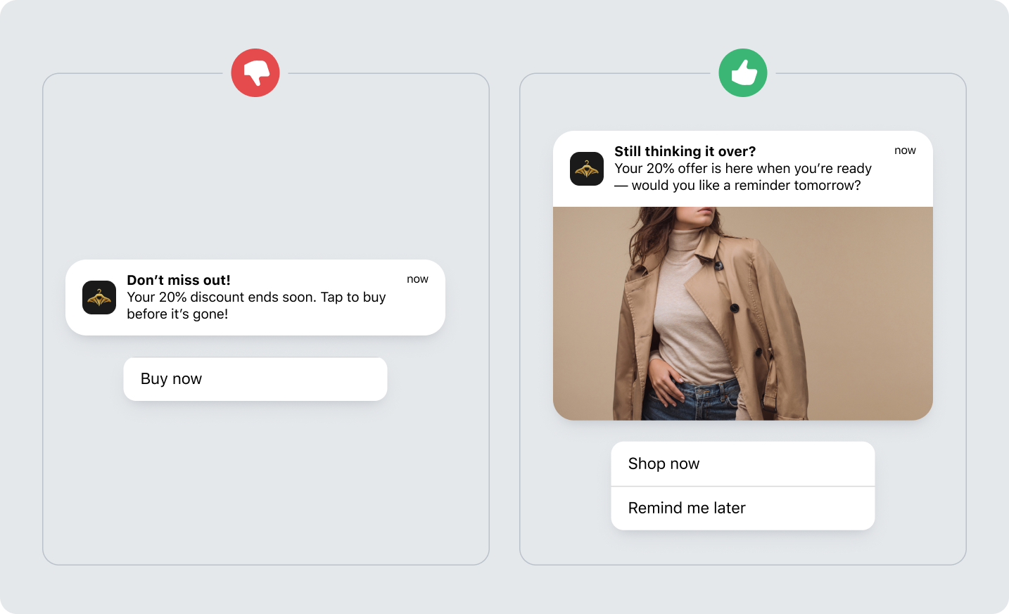
We’re not advocating for you to remove the option to say “no.” But it’s worth pointing out that every option should feel intentional. Users can buy now, be reminded later, or ignore the message entirely, and all three choices feel valid. Both versions drive action, but only one builds trust by respecting the user’s sense of control.
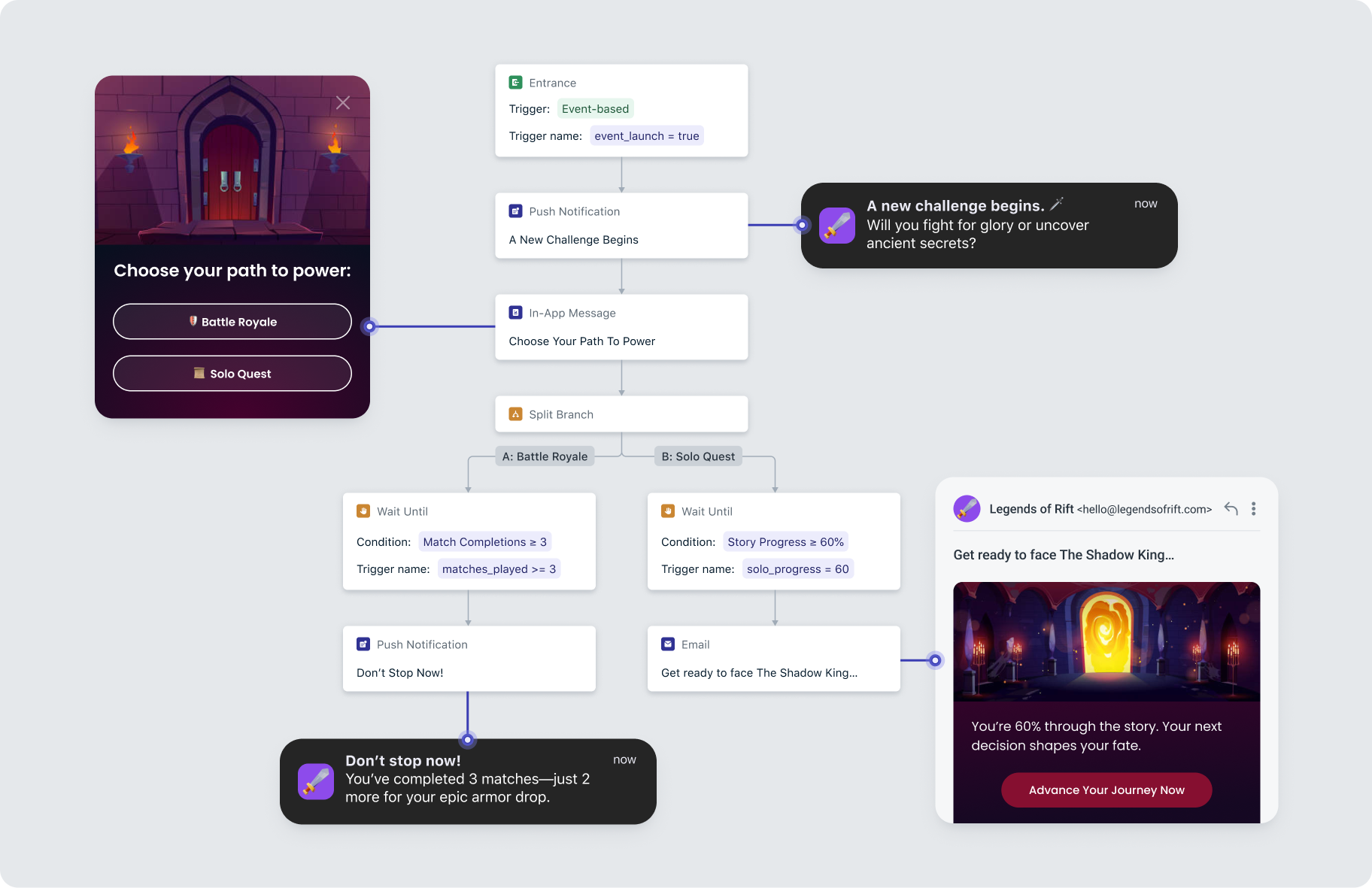
Combine this approach with airtight timing and you have a recipe for long-term retention. This is where OneSignal’s Intelligent Delivery helps marketers get the details right. Instead of batching messages at random or guessing when users might be active, Intelligent Delivery learns from engagement patterns to send messages at the ideal moment for each person.
Messages using Intelligent Delivery see 69% higher engagement than those manually scheduled to be sent later.
Framing is everything: How tiny word choices change behavior
Two messages can say the exact same thing and lead to completely different results.
That’s the power of framing, the psychological principle that describes how the way information is presented influences the decisions people make. Remember, context > content!
Consider these two notifications:
“Your trial is ending — upgrade now.”
“Keep your progress going — your trial ends soon.”
Both communicate the same fact. But the first one triggers loss and urgency, while the second emphasizes continuity and momentum. One says “you’re about to lose something.” The other says “you’ve already built something worth keeping.”
People don’t want to feel like they’re being forced to protect what’s theirs; they want to feel capable of preserving it.
In other words: framing shouldn’t merely push people toward action, it should make that action feel good, obvious, and self-driven.
Want more psychologically-driven brainfood, specifically for mobile marketers? Our Mobile Marketing Psychology Guide goes into10 psychological drivers behind today’s most effective mobile marketing campaigns.
Here are a few simple framing shifts that help messages feel more empowering than pressuring:
| Old Frame (Pressure) | New Frame (Empowerment) |
|---|---|
| “Don’t miss out on your reward” | “Your reward is waiting for you” |
| “Your trial expires tomorrow” | “You’re almost there — keep your access going” |
| “Time’s running out to claim your deal” | “Claim your deal whenever you’re ready — we’ll hold it for 24 hours” |
| “Enable notifications to stay updated” | “Choose the updates you want — we’ll do the rest” |
Small language shifts like these can transform the tone of your app’s entire message ecosystem, especially during high-pressure moments like renewals, upgrades, or limited-time promotions.
When in doubt, remember: positive framing keeps users moving forward; fear-based framing keeps them second-guessing.
This is also where experimentation pays off. Within OneSignal, you can use A/B Testing (even within automated cross-channel Journeys) to test different tones, headlines, and button copy across push, email, and in-app messages, then automatically learn which framing resonates most with your audience segments. Over time, your system gets smarter about why users respond, not just when.
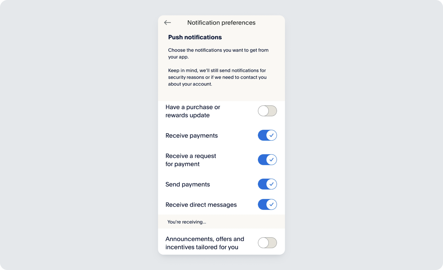
Defaults define “normal” — So set them intentionally
Humans love shortcuts (looking at you, every teenager that’s ever existed).
The way you set up your messaging defaults can quietly shape engagement patterns for months. A simple choice like auto-subscribing users to “important updates” while letting them easily toggle off promotions sends a clear message: “We’ll handle the essentials, you stay in control.”
Two quick ways to apply this thinking:
- Progressive onboarding: Default new users into “learning mode” by sending helpful tips or guided in-app prompts before upsells.
- Gentle re-engagement defaults: Use a simple “Snooze” option over “Unsubscribe” to preserve flexibility without pressure.
- Preference centers: Centralize opt-ins and channel settings so users can easily update how and when they hear from you—a small step that builds long-term trust.
Habits are built one tap at a time
Big loyalty starts with one small yes at a time.
Micro-commitments are low-friction actions—a tap, a rating, a simple choice—that pave the way for deeper engagement later. When users say yes once, they’re far more likely to say yes again.
That’s commitment bias at work: people prefer to stay consistent with what they’ve already started.
You can use this to build momentum without feeling pushy:
- Start small: Ask for a quick “Rate your experience” before requesting a full review.
- Foster belonging: Use in-app polls or mini-choices like “Which challenge do you want next?”
- Reward progress: Follow up one small action with the next logical step (not a leap!)
With OneSignal Journeys and Events, you can chain these micro-moments automatically. A user who completes one action can trigger the next—a feedback prompt, a feature tour, a referral offer—creating a seamless flow that feels self-directed, not scripted.
Small commitments, repeated often, become habits. And habits are the foundation of retention.
More isn’t always more: When good options go bad
Giving users choices builds trust, but giving too many can do the opposite. Too many options can often paralyze users and make them less satisfied with whatever they pick.
The fix? Clear, minimal options help users move forward confidently.
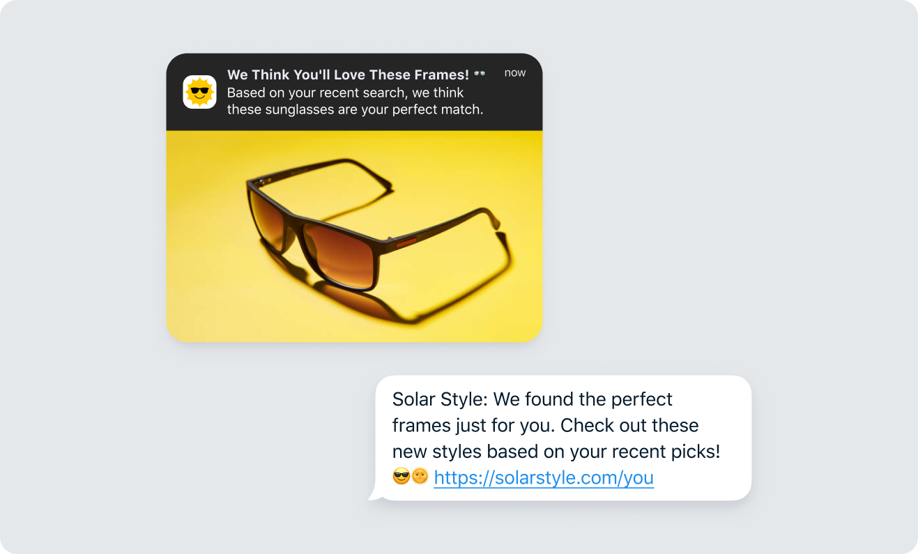
- Curate, don’t catalog: Rather than overwhelming users with every possible offer or product, surface one or two tailored recommendations based on their behavior. Too much relevance still feels like clutter.
- Guide gradually: Don’t flood new users with choices during onboarding; introduce preferences contextually as they explore.
- Make it intuitive: “Get notified when your favorite creator posts” is far more inviting than five sub-categories of notification types.
With OneSignal’s event-based targeting, you can personalize offers and content automatically, learning what matters to each user without forcing them to choose upfront. That way, personalization happens for them, not to them—keeping your experience frictionless and fatigue-free.
Are you designing user decisions for the long game?
Every message, from your first welcome push to your win-back email, is an exercise in choice design.
Each touchpoint represents a moment to either overwhelm or empower, to pressure or to guide. When messages feel considerate, consistent, and contextual, users move beyond fleeting “engagement” to trusted, habitual use.
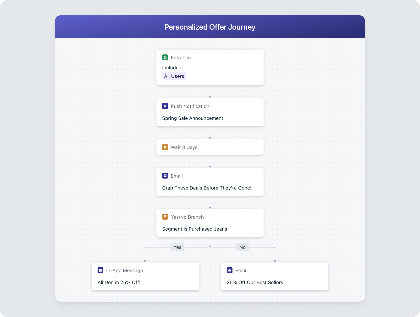
With OneSignal, you can design these decisions dynamically using Events, Journeys, and Intelligent Delivery. Every message adapts to the user’s behavior, timing, and preferences— creating a journey that feels hand-guided.
Our goal is to give you the tools you need to spark a conversation users actually want to continue.
The mobile marketer’s new superpower: Designing for decisions
Great messaging shouldn’t demand attention. You earn it by making good choices feel natural.
As inboxes and screens overflow this holiday season, try treating ethical persuasion as your new retention moat. The brands that guide gracefully will be the ones users choose to keep around.
That’s exactly what OneSignal is here to help you do. Try us out for free and see if we’re a good fit, or take some time to think about it and come back (...you know, to let you steer your own experience 😉)
Get Started for Free