We just launched our new website and turned to Craft CMS for our content management solution.
Until recently our .com and web application shared the same Rails codebase. This creates several issues. Content managers can’t make changes easily. Any time we want to make a change we have to do a full deploy. Even if you’re comfortable doing this, it can be a cumbersome task making changes, and for me, there is always a fear of breaking the app when deploying.
After researching our options looking at the different CMSs and tools available (like Wordpress, Drupal, Contentful) we decided that Craft CMS was the way to go thanks to various good comparisons online; speed, flexibility, lightweight footprint, and localization were some of the pros that consistently came up. Within a few weeks we had our new website shipped. It was a big project with a quick turnaround. Here are some things we love about Craft and learned along the way.
Twig Templating
Twig is awesome. My experience using CMSs in the past is usually having to write PHP or some server side code to manipulate the templates. Twig is a template engine for PHP so instead of writing PHP you write in this simple Twig syntax. Example:
{% for post in posts %}
  {{ post.title }}
{% else %}
  You don’t have any posts yet.
{% endfor %}
Matrix Fields
Matrix fields are great for enabling our marketing team and content managers to create and style their own pages while staying within the constraints of the design system.
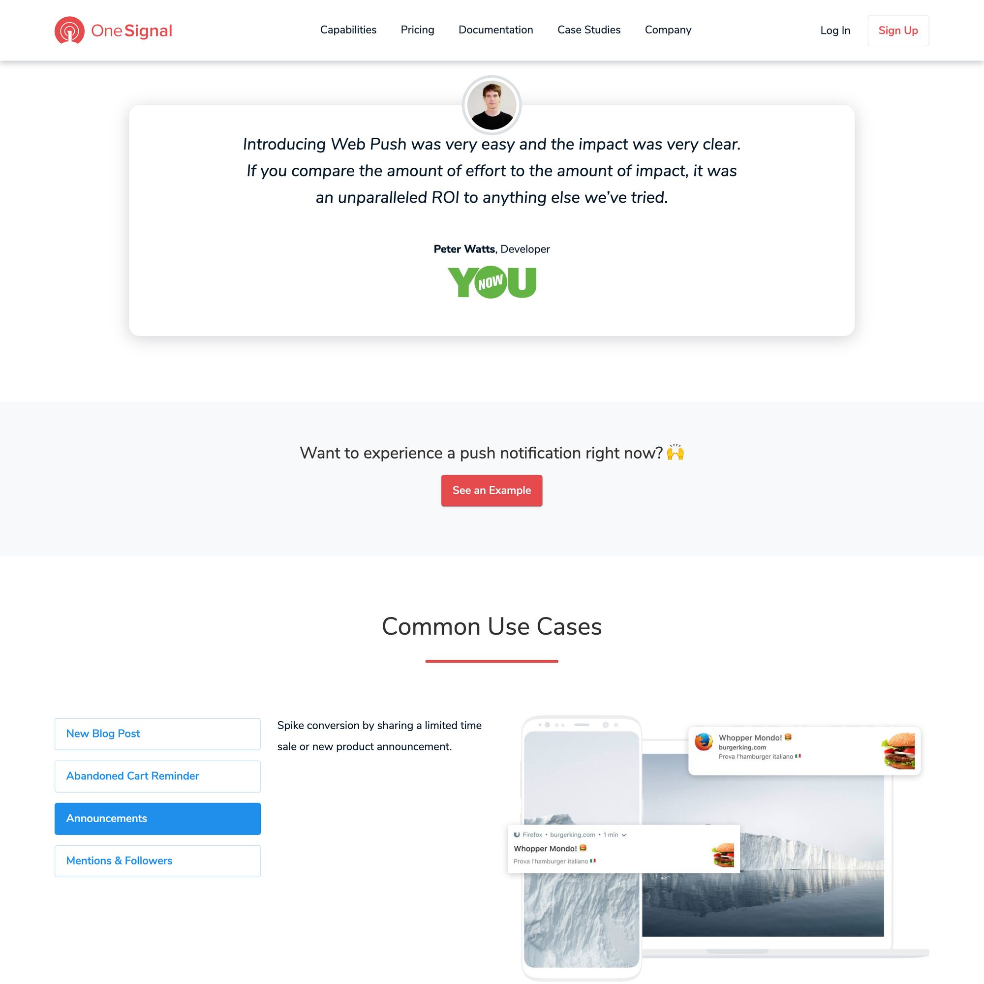
Here’s an example for our Web Push landing page. As you can see it is made of a series of “blocks”; image left, image right, logo list, quote block, tab component etc.
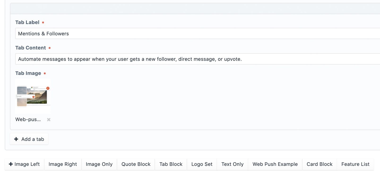
In the CMS the content editor can decide what type of block they want to add from a predefined list.
Components
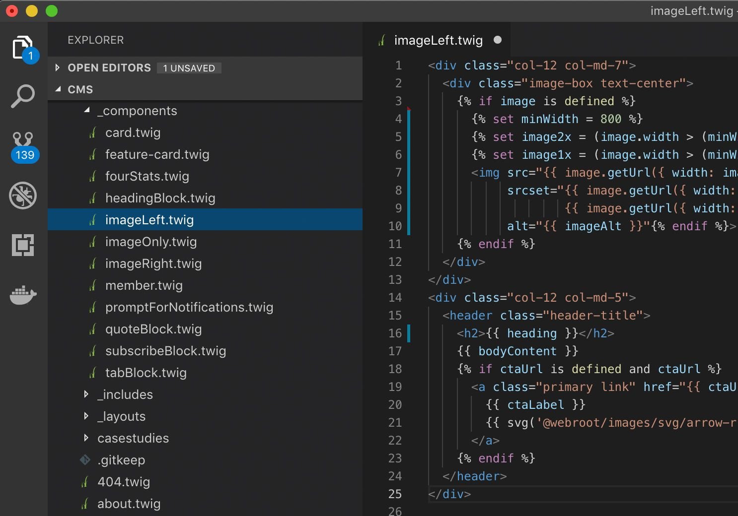
Again thanks to Twig templating, this makes is easy to “component-ize” your elements. This way you define the markup and layout for a component once then reuse it throughout your site and pass variables.
We defined components for different content modules like image left, image right, headings, cards etc. This enables us to reuse the same components throughout the site, reducing duplicate code and ensuring we’re consistent.
Local CMS Development, Docker & Migrations
This is an area we initially struggled with as it wasn’t that intuitive what the best practice was here for working across environments, people and branches.
The project.yaml file and warnings can be scary and confusing at first. This file defines your configuration and what is being saved in the database. The idea is that, by storing configuration such as sections and entries in this file, disparate databases can be configured identically without a need for complex migrations.
However, we saw this screen a lot at the start of our project:
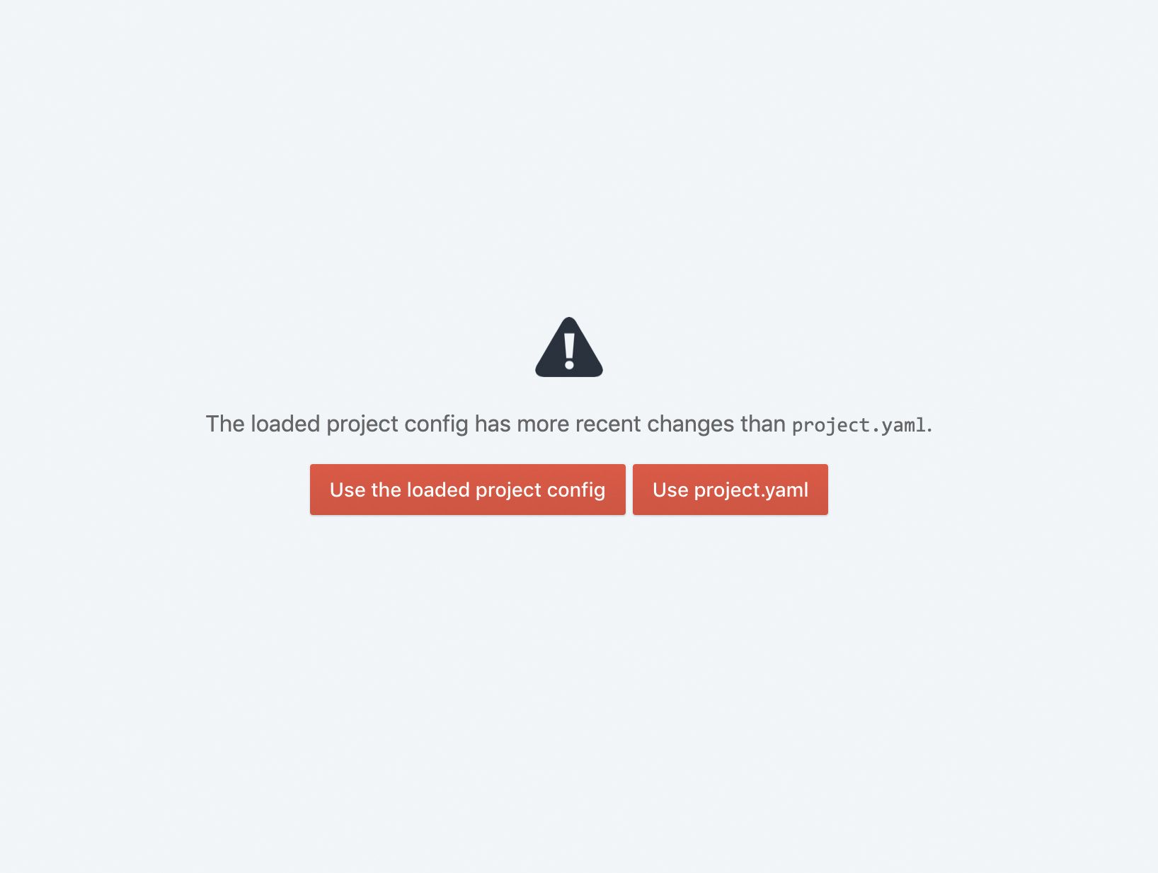
Our original dev flow was to blame. We had multiple contributors working on different branches of our project, and we had a shared dev database. Whenever someone would make changes, everyone else's project.yaml became out-dated.
The solution in our case was to eliminate the shared dev database in favor of local databases only. We still have a shared staging and production database, but our CI/CD process enforces an always-forward project.yaml migration path.
Plugins
Every plugin I come across for Craft CMS feels professional and polished. They have a nice one click install via the admin dashboard and there are a generous amount of free plugins available.
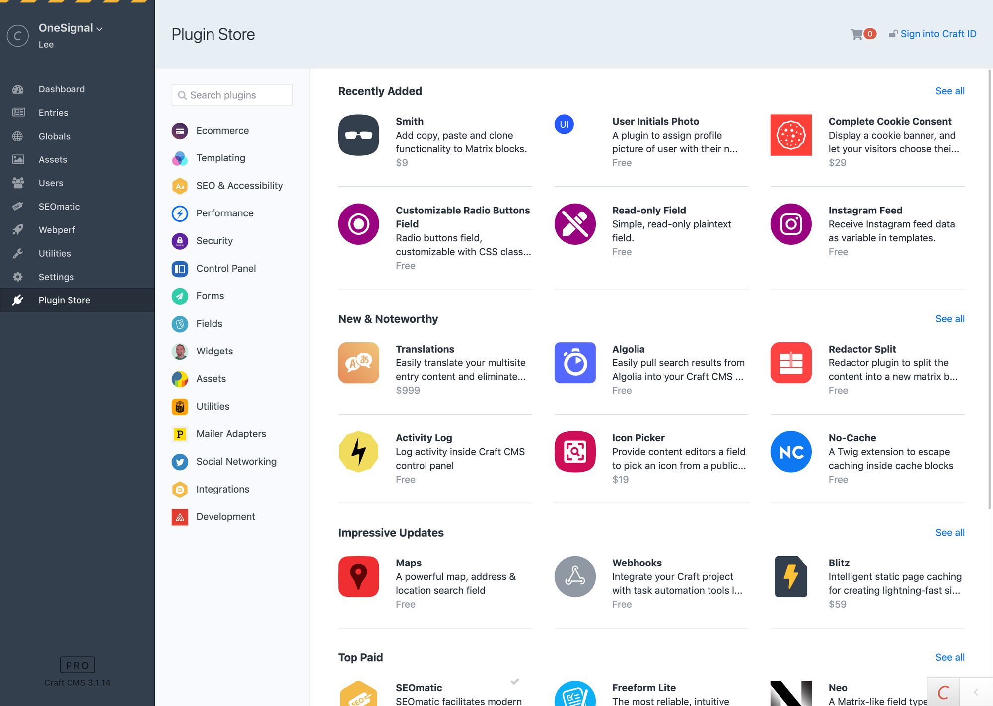
Here are the plugins we’re currently using.
- SEOmatic for SEO
- Salesforce Leads for Salesforce integration from our demo form
- Mailgun as our email service provider
- Webperf for performance monitoring
- Image resizer to resize images via admin panel
- Amazon S3 for asset storage
- Anchors for adding anchors to large bodies of text e.g. Terms of Service
- Asset Usage to help clean up unused assets
- Redactor for rich text editing
- Super Table for embedding a tab component in a matrix field
Community and Training
One of our concerns going into this with Craft was the community isn’t as big as Wordpress so it might be harder to find solutions to problems. But we soon learned this wasn’t the case. Every issue we came across had a solution that was well documented usually from a Craft CMS Power User or someone from Pixel & Tonic (the company behind Craft).
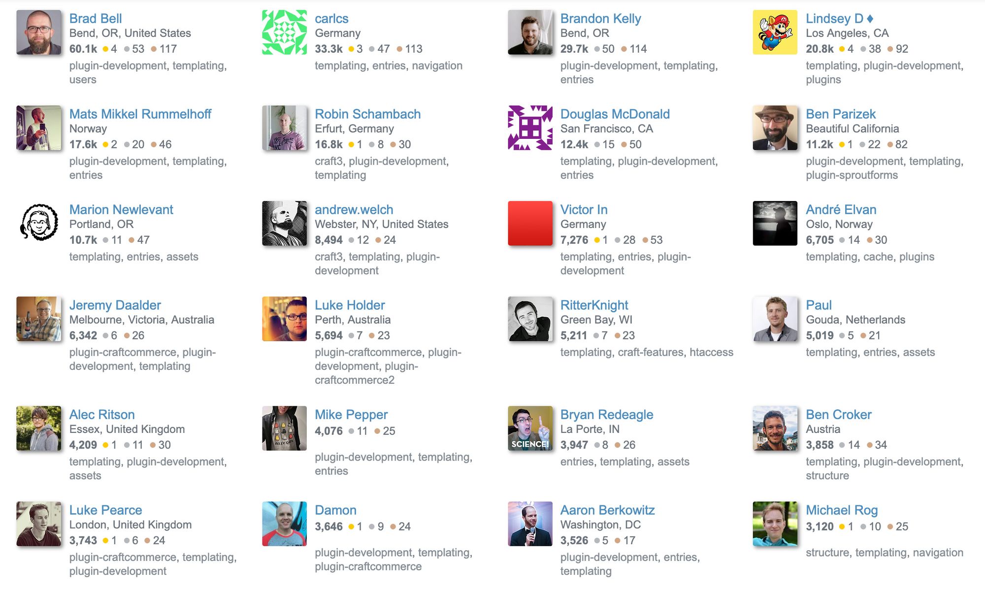
For training, we relied heavily on Ryan Irelan’s Mijingo collection of Craft video tutorials and Andrew Welch’s detailed technical blog posts.
Responsive Images for Design
This is an area that wasn’t as straightforward as I had hoped. Our goal is to have 1x and 2x versions of every image that are compressed and at the correct dimensions required. That way we can serve a well optimized image to the user depending on their device and screen resolution.
At first we tried setting up Image Transforms which come with Craft out of the box. However in practice we ran into issues where the image would resize even if it was smaller than the defined transform width, resulting in larger images and file sizes than needed. There are a few detailed posts on using macros and other logic to make sure your images are bulletproof. We ended up using a version of Trevor’s solution here. We first check to see if the image is an SVG or not. Then we check if the image is larger than a minimum width that we set. Then we resize accordingly and use srcset to provide a 1x and 2x version.
{% if image.extension == "svg" %}
  {{ svg('{{ image.getUrl() }}') }}
{% else %}
  {% set minWidth = 250 %}
  {% set image2x = (image.width > (minWidth * 2)) ? (minWidth * 2) : image.width %}
  {% set image1x = (image.width > (minWidth)) ? (minWidth) : image.width %}
  <img src="{{ image.getUrl({ width: image1x }) }}"
       srcset="{{ image.getUrl({ width: image1x }) }},
               {{ image.getUrl({ width: image2x }) }} 2x"
       alt="{{ title }}">
{% endif %}
Conclusion
Overall we are big fans of Craft CMS at OneSignal. It feels faster and less bloated than other CMSs I’ve worked with and so far it’s something our designers, developers and marketers have all enjoyed working with.
Check out our new website, and let us know what you think!
By the way, we’re hiring software engineers. Take a look at our open roles today.
View Our Open Positions